The iconic red telephone box was intended to be grey
The classic red telephone box has been named the most iconic British design of all time, but did you know the designer of the famous kiosk wanted it to be grey?
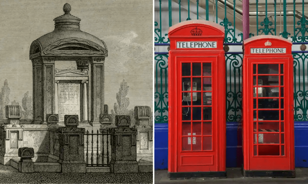
Sir Giles Gilbert Scott suggested the colour silver for his K2 model (left), and preferred a more neutral coloured exterior for the K6 (right). He first suggested “toned white,” but then changed his mind to “a warm, dove grey”.*
He was, however, overridden by the Post Office, who wanted it in red. They reasoned that the telephone box needed to be “sufficiently conspicuous to be readily distinguished from its surroundings.” This decision to paint the telephone boxes red was endorsed by the Royal Fine Art Commission and the Councils for the Preservation of Rural England, Wales and Scotland.
One member of the CPRE said that it was a “functional colour,” like an exclamation mark in the landscape.
The only valid argument is that red, the good clean Post Office red, is a functional colour. The fact that I like it, and loathe the limp suggestion of a medium grey, is just an example of my personal taste…the vivid scarlet kiosk only appears to me as a piece of agreeable punctuation
John Gloag, design writer and member Central Executive Committee of the CPRE, 1936
Scott later conceded that the Royal Mail’s choice of red worked well in urban areas but maintained that it would be an eyesore in rural areas.
I am more convinced than ever that bright red kiosks in an old village street or a village green will be an abomination.
Sir Giles Gilbert Scott, designer of the classic red telephone box [19 August 1935, POST 33/5155 (9)]
Scott’s predictions proved accurate and there was backlash against the bright red telephone boxes in many rural areas. In a letter to his MP in July 1936 Hubert Thornley, clerk for the North Riding of Yorkshire, claimed the “super pillar-box red” to be “like an evil deed in a good world”.
like an evil deed in a good world
Hubert Thornley, CLERK FOR THE NORTH RIDING OF YORKSHIRE, on the ‘pillar-box red’ colour chosen for telephone boxes, 1936
Following pressure from CPRE members and the House of Lords, in 1946 the Postmaster General organised a review of the colour.
Any colour as long as it’s red
Representatives of the Ministry of Town and Country Planning, the Royal Fine Arts Commission and the Council for the Preservation of Rural England gathered to look at new colours for the telephone box. They viewed six models painted in different colours; Post Office Red, Deep Brunswick Green, Middle Brunswick Green, Black, Light Battleship Grey, and Dark Battleship Grey. They kept the bars red (see last image).
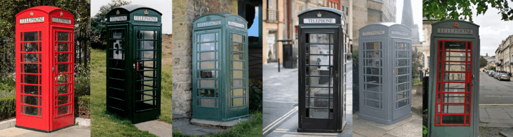
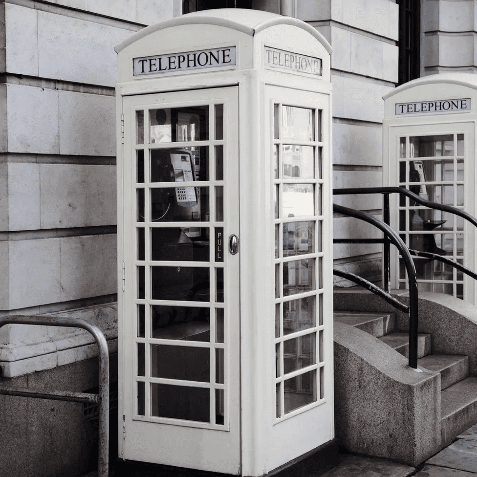
In the end the 1946 committee decided to keep the red colour. The exception was for a few areas of natural beauty where there was much public opposition to the red colour, here they could allow the kiosks to be painted in dark battleship grey (see above right of a preserved telephone box in the historic town of Bath).
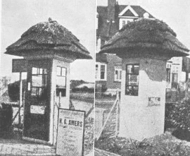
Thatched telephone boxes
In Eastbourne the council thought the red telephone boxes were not in keeping with the local buildings, so they insisted on having thatched roofs for their kiosks.
Sources:
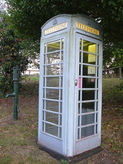
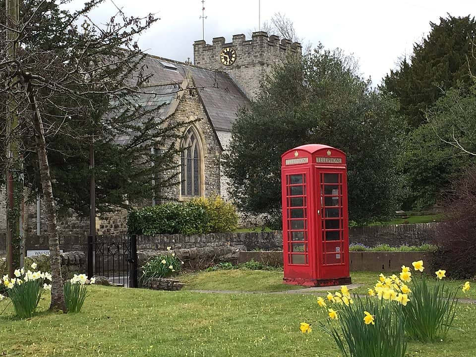
Feature photo by hwr888 in Courteenhall just south of Northampton. There are two explanations for this: in 1946 the CPRE arranged with the Royal Fine Arts Commission that in some rural areas of special beauty the kiosks could be painted grey. Courteenhall is on the National Heritage List for England so that would make sense. The other explanation is that the red paint has peeled away over time or been sanded away to reveal the grey undercoat.
| *Public telephone kiosks: competition for improved design, Sir G Scott’s model adopted Kiosk No 2 or K2) |